Crafter-mornings All!
Here as promised, is my version of the template I posted earlier!
But first - I need some inspiration - and this is how I found it - by looking around the house and creating a small vignette of what represents 'meaningful - and thankful' to me! And I found it in an odd assortment of little and not-so-little items just layin' about! It started with the large origami heart made for me by my daughter when she was about 10. She created it out of poster board - wow, can imagine how hard she was pressing on those folds, lol! At the time, she gave it to me chock full of smaller origami hearts that each had a promise on it - for folding the laundry, free "anytime with her" (yeah - they know!), etc., etc. So then I gathered her picture that I love, and my 'second' parents picture in a frame I decorated in the '80s, and my dog's blanket! Oh - and a candle holder my daughter and I stained plus the velvet rose I made for a smaller candle holder. Enough to pull together my theme of love and appreciation!
My inspiration....
main |
sidebar

Stamp Set: Word Play; Cardstock: River Rock {card base, tag base}, Marina Mist, Night of Navy, Tangerine Tango and Big Shot die and embossing folder {not shown}: Two Tags and Perfect Polka Dots.
$15 per person
GTA area.
Reserve a Spot!
Email: craftroomafternoons@gmail.com
About Me

- Taylor
- This is my private blog dedicated to my Stampin' Up! " toys "! I retired as a SU! Demonstrator but I still teach classes for card-making, scrapbooking and other fascinating paper crafts. I LOVE this craft hobby and have been doing it every chance I get while being a MOM to one beautiful daughter {and I feel like a Mom to one furry mutt}. Hopefully I can share my passion for crafting with anyone and everyone interested in this fabulous hobby! I am also a tech weakling, so please excuse my blog "oopsy's" as Blogger can be mystifying!
Followers
Blogroll
Taylor B. Powered by Blogger.
23 September 2011
My Thankful Card using a Template, Word Play Stamp Set and Stampin' Up!'s Color Coach!
Posted by TaylorI shall scrapbook this picture soon too!
This I highly recommend - to take visual vignettes for your scrapbooks!
And here is my card!
As you can see I have followed yesterday's TEMPLATE pretty closely!
Our WORD PLAY Stamp Set provided the sentiment - this is a very good stamp set to have as it has many appropriate greeting/sentiment stamps in it.
USING OUR COLOR COACH TO GUIDE YOU WITH COLOR COMBINATIONS!
To gain more inspiration - or to push yourself in NEW DIRECTIONS - and great for BEGINNER STAMPERS - our COLOR COACH from STAMPIN' UP! is excellent.
Here is how it works.
For my card I used the following:
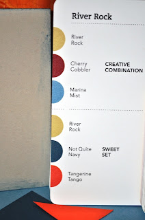
AND...the Color Coach {shown in the bottom right of pic} - which gave me
my inspiration for my colour choices!
All you do is flip to the card of the main colour you are interested in - mine was River Rock...
....which is this card flipped open.
CLICK on pics to see LARGER!
Now you can see, the card pertaining to River Rock shows 2 COLOUR COMBINATIONS - one is Creative Combination calling for Marina Mist and Cherry Cobbler to be paired with River Rock.
The second combination, Sweet Set uses River Rock with Not Quite Navy and Tangerine Tango!
Therefore - I used Marina Mist, Not Quite Navy as the main layers on top of my River Rock - AND -
used Tangerine Tango to create a flower accent - a little pop!
Of course Whisper White is a good neutral and brings lightness to the whole card.
So there you are - choose any of our colours, and you can find valuable help
with the COLOR COACH - the above example is for the colour REAL RED - and the two combinations may surprise you - Real Red, Early Espresso and Pumpkin Pie - that sounds like a delicious FALL COLOUR COMBO while Real Red, Bashful Blue and Crumb Cake would make a
terrific CHRISTMAS combination!
The COLOR COACH is available for order - you'll be
pleased with it - as it is simply 'full' of great ideas!
It is in a handy form, easy to read and use!
Subscribe to:
Post Comments (Atom)
CLASS / KITS
BOOK A PRIVATE CLASS
$15 per person
GTA area.
Reserve a Spot!
Email: craftroomafternoons@gmail.com
Wish to be on my Mailing List regarding Classes - Contact Me and I'll be happy to add you on!
OCCASIONS MINI
Labels
- 3D (38)
- A Worthy Cause (1)
- ACCENT-Flower (29)
- ACCENTS - Acetate (1)
- ACCENTS - Ribbon (7)
- ACCENTS-Buttons (6)
- ACCENTS-Chipboard (2)
- ACCENTS-Fabric (1)
- ACCENTS-Felt (1)
- ACCENTS-Glitter (3)
- Altered Art (8)
- Articles (1)
- Awards (2)
- Back-to-School (1)
- Beyond the Garden Happy Greetings (1)
- BFF (1)
- BLOG CANDY (6)
- Bordering on Romance (1)
- BRIDAL (6)
- Card - Fall (1)
- Card Making 101 (1)
- CARD SUBSCRIPTION SERVICE (1)
- CARDS - Baby (4)
- CARDS - Birthday (13)
- CARDS - Christmas (12)
- CARDS - Folded (6)
- CARDS - Friends-Family (4)
- Cards - Halloween (1)
- CARDS - Love (5)
- CARDS - Male (4)
- CARDS - Mother's Day (2)
- CARDS - Multiple Occasions (3)
- CARDS - Nature (7)
- CARDS - Specialty (1)
- CARDS - Spring (6)
- CARDS - Summer (3)
- CARDS - Sympathy (1)
- CARDS - Thank You (1)
- CARDS - Wedding (1)
- CARDS-Sets (2)
- Centerpiece (1)
- Challenges (6)
- Challenges 2012 (1)
- CLASS - WINTER 2010 (1)
- CLASS-CHRISTMAS 2010 (6)
- CLASS-SPRING 2010 (7)
- CLASS-SPRING 2012 (4)
- CLASS-SUMMER 2010 (3)
- COLOR COACH (1)
- Colouring (6)
- Contest (1)
- CREATIVE CRAFTERS (1)
- Custome Envelopes (1)
- Cute Overload (1)
- Decor Elements (1)
- Decorating (1)
- Demonstrators (1)
- DESIGNER SERIES PAPER (1)
- DIE-CUTTING (9)
- DIE-CUTTING BIG SHOT (34)
- DIE-CUTTING Punch Art (13)
- DIE-CUTTING PUNCHES (23)
- DIGITAL DESIGN (2)
- Effects - Smooch/Spritz (1)
- Entertaining (2)
- EVENTS - Holiday (2)
- EVENTS-Holiday (3)
- EVENTS-Open House (3)
- Favourite of the Week (2)
- Favours (2)
- FEATURED TOOL (3)
- Framelits Heart Die (1)
- Framelits Label Die (1)
- Free Stuff (1)
- FYI (1)
- GIFTS - Baby (2)
- GIFTS - Family Friends (10)
- GIFTS - Friends (2)
- GIFTS - Teachers (4)
- GREETINGS - Poems (1)
- Guest (2)
- Hall of Shame (1)
- Hello (1)
- Holidays (11)
- Holidays - Easter (5)
- Holidays - Halloween (2)
- Holidays - Valentine's Day (11)
- Holidays-Christmas (33)
- Home + Family (7)
- Home + Garden Motifs (6)
- Home Decor (1)
- Hostess Specials (1)
- Idea Book and Cataloque (1)
- Kids (1)
- Kitchen Aid Musings (1)
- MDS (2)
- Miscellaneous Projects (7)
- Morning Coffee with Beverly (2)
- Morning Coffee with Taylor (1)
- Mosaic Card (1)
- MOTIF - ANIMAL (6)
- MOTIF - Birds (4)
- MOTIF - Circles (4)
- MOTIF - Friendship (8)
- MOTIF - Garden (6)
- Motif - Get Well (1)
- Motif - Hearts (7)
- MOTIF - Scalloped (5)
- Motif - Shabby Chic (1)
- MOTIF - Various (1)
- MOTIF-Butterfly (5)
- MOTIF-Fruit (1)
- MOTIFS - Baby (4)
- My Digital Studio (2)
- MY RANTS and RAVES (1)
- MY YOUTUBE CHANNEL (1)
- New Craft Room (1)
- Noteworthy (2)
- Organization (2)
- Photo Frame (1)
- PLACE OF HONOUR (1)
- Pocket Boxes (1)
- POPULAR PROJECTS - Boxes (8)
- POPULAR PROJECTS - Fat Pages (2)
- POPULAR PROJECTS - Mini Albums (4)
- prize (5)
- PRODUCTS (5)
- PROJECTS - Birthday (3)
- PROJECTS - Pets (2)
- Punches (11)
- Recycle (5)
- ribbon (5)
- Rosettes (1)
- Rubberstamping Basics (1)
- SANTA (1)
- Scalloped Circles (1)
- Scalloped Circles and Borders (4)
- Scrap Envelope and Card (1)
- SCRAPBOOK - New to (1)
- SCRAPBOOK-Pages (10)
- SCS (2)
- Simple Cards (3)
- Simply Adorn Jewellery (1)
- Simply Scored (1)
- SNEAK PEEK (1)
- Snowflake (1)
- Snowman (1)
- Sock Monkey (1)
- Specialty Cards (2)
- Spotlighting (1)
- Stamp Club (1)
- Stamp-Ma-Jig (1)
- STAMPIN UP - JOIN (3)
- Stampin Up - NEWS (4)
- Stampin Up - Promotions (1)
- Stampin Up - RETIRED (6)
- Stampin Up MAKES (62)
- Stampin Up Mini Catalogue (5)
- Stampin Up Sale-A-Bration (8)
- Starting Out (2)
- Strange But True (1)
- SU - IN COLORS 2012-2014 (1)
- SU CATALOG (1)
- SU News (8)
- SU-In Colors-09 (4)
- SU-In Colors-2011-2012 (1)
- SU-In Colors-2011-2013 (1)
- Summer (2)
- Swap (2)
- Tags (6)
- Teapot (1)
- Technique (3)
- Technique - Folding (4)
- Technique- Dyeing (1)
- Technique-paper piecing (1)
- Technique-paper piercing (3)
- Technique-paper quilting (1)
- Techniques (13)
- Techniques- Embossing (6)
- Templates (2)
- Thank You Card (1)
- THANK YOU CARDS (1)
- The Nicest Things (1)
- Tim Hortons (1)
- Tools (5)
- TROPICAL (1)
- Tutorial (11)
- TUTORIALS - Guest (3)
- Vacations (1)
- Vellum (1)
- VIDEOS - SU (1)
- Vintage Voque (2)
- Volunter Projects (2)
- Wall Art (1)
- Window Cards (2)
- Winter Cards (1)
- Workshops (2)
- World Card Day (2)
Archive
-
▼
2011
(101)
-
▼
September
(10)
- Kitchen Aid, Biscotti and Ice Cream - my wicked pl...
- My Thankful Card using a Template, Word Play Stamp...
- TEMPLATE FOR A CARD
- Fantastic Ways to Impress People that you will CRA...
- Make Lovely Handmade Cards for Fall
- A sweet Songbird needed compassion and received it...
- Holiday Cards for a Bingo Player!
- I've finished my Carribean Vacation Mini Album!!
- Back to School! Create Easy Projects for Students...
- Whooo-hoooo! NEW HOLIDAY MINI CATTY !!!
-
▼
September
(10)
Template by:


0 comments:
Post a Comment