* Crafters!
Here's an idea I'd like to share today - and its for anyone in to scrapbooking or cardmaking or home decor projects - even fabric projects! Simply apply the techniques to your project adapting them for your particular surface! OK!!!
* I have some white and vanilla 12x12 cardstock in my collection as many of us do - and every so often I like to make a scrapbook page right from scratch - not a purchased "patterned paper' such as Stampin' Up!'s Designer Series Paper but something TOTALLY and UNIQUELY MINE!
To do this I:
STAMP my OWN BACKGROUND DESIGN
onto the 12 inch cardstock. Voila!!!
You are only limited by your own imagination, you can apply many, many techniques for this using rubberstamps, colouring techniques such as rag-rolling, spritzing or sponging ink, or even resist techniques {try scribbling a wax crayon onto the cardstock then sponging colour overtop}. Basically the techniques we use to make most of our projects. This is just on a larger scale.
To to get you thinking today...
I have chosen TWO TECHNIQUES for this demo -
- using rubberstamps and
- using a stencil.
RUBBERSTAMPING A BACKGROUND DESIGN
- Using a Pencil Grid
Stamping backgrounds can be relatively easy when you take your largest stamp and stamp in no particular pattern followed by smaller stamps filling in the gaps. The results are pleasing.
However, some very refined designs can be created if you take the preliminary step of creating a pencil grid using lightly drawn lines which are easily erased afterwards.
I created my grid with North-South/East-West and diagonal lines - in equal distances. I am careful to create straight lines and watch to see that the intersections cross properly.
Creating a grid of pencil lines across a 12x12 cardstock page.
MAKING DECISIONS.
There is preparation but its not long - I did this in a few minutes by looking over my stamp sets and just experimenting! This IS fun remember?
OK, I chose my stamps ahead of time - thinking about the type of look I am going for - ex) floral or fun characters? You also need to consider the SIZE of the image. A small stamped image or a large one? Should the pattern be everywhere or widely spaced apart?
I have decided to create one large GRAPHIC IMAGE by combing several stamps - which share the same style - but different styles would produce some interesting looks in my opinion.
Today I decide to create the design using 3 stamps - it only looks like 4
but I stamped the flower twice[ AND by flipping it's direction]!
My choices are a leaf - a flower and a heart.
Orientation of the stamps is another decision - here is where the grid is handy: to group my stamped images together. I began by stamping the larger LEAF FLOURISH on a straight North-South pencil line, and then stamped the FLOWER on either side (a East -West direction) and slightly below and finished beneath the flowers with a HEART once again back on center!
So 1step - 2step -3step - 4!
Hey we're dancing!!!
CLICK ON PICTURES!
Sorry image is on its side - will fix! LOL! See image below!
Once I have made my mine up as to how I want the 'design' to look - all I have to do is repeat it around the rest of the page!
HERE IS THE PATTERN EMERGING!
* STENCILING A BACKGROUND DESIGN
This is important to note - Stampin' Up! Customers!
SU has regrettably decided it will no longer carry our DECOR ACCENTS line of products when the new 2012-2013 catalogue is launched. So if you are like me, and value having a stencil or two in your arsenal - then please have another look at the fabulous line of stencils we currently carry.
I will be most pleased to help you - email me.
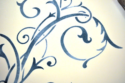
To stencil a background there is not much to consider other than the stencil choice and how much of it will you stencil onto your page. Partial images look nice off to one side - or maybe in each corner like a 'frame'. I have one stencil here that is large and so I have chosen it to be my background. Its a lovely flourish style. AND I will be using it for the first time - yah!
I have gone with a deeper blue this time for my ink choice - BUT - {there's always a but}...using a sponge as my weapon of choice to deliver the ink to the paper {rather than say a brayer!}....I realize I maybe stumping my sponge all night! Its such a large design - but I carry on. Thankfully, to sponge the ink on in a un-even fashion is more appealling than applying an even coat of ink throughout the stencil. I decide to apply more ink towards "ends" such as the flower heads, and the tips of leaves and flourishes.
Just keep the stencil down and stump your sponge in a direct up and down motion. In a design like this, also be careful not to bend the stencil by accident in areas where the laser-cut design ends or is narrow - you can wash off the ink easily if you use water-soluable ink like our CLASSIC INKS.
I am using one of our new colours " Island Indigo ".
Isn't it pretty?*
Sponging a Stencil using Stampin' Up!'s Classic Ink in Island Indigo!
AND THE PROOF IS IN THE PUDDING - LOOK AT MY FINGERS!!! :)
COME BACK TO SEE PART 2 TO SEE WHAT MORE I DO TOWARDS THE FINISHED PROJECTS in PART 3 !!!
Meanwhile GET STARTED ON YOUR PROJECT!
SEE YA!
STAMPIN' UP STENCILS
2 Stencil Products - Many More Designs, Assorted Sizes
MOSTLY VINTAGE STENCIL 118877 $10.85
FLOURISH DECOR STENCIL 117581 $11.95


0 comments:
Post a Comment